Contacts Feature Redesign
AccuLynx’s CRM (Customer Relationship Manager) is a feature that allows users to manage their job contacts and help maintain and build relationships with their customers.
The Challenge
This was a unique project for me because the contact feature already exists in our mobile app. The challenge for this project was understanding users’ current frustrations with contacts and how we could improve their experience. The new design needed to be more intuitive for the users because we discovered many were not using contacts as intended.
Project Objective
My objective for this project was to redesign an ineffective contacts feature and make it more useful for our customers. It was essential to learn directly from the customers to understand their expectations for a CRM feature and what parts of our current feature led to user frustration.
Design Process
Learning and Understanding the Feature
The first step of this project was to learn how the current CRM feature worked within our app. I took the time to navigate the feature and note any potential pain points a user may experience while using the app and where I thought areas could be improved. I mapped out the flow of how the current contacts feature behaves to understand it more thoroughly.
User Research
My design partner and I conducted a series of interviews with customers to
better understand their frustrations with the current CRM feature.
We asked our participants a series of questions that we created based on
complaints our customer service team had collected about the feature. Below
are a few key findings from the research.
Key Findings:
Below is a list of my key findings from the user interviews that my partner and I conducted:
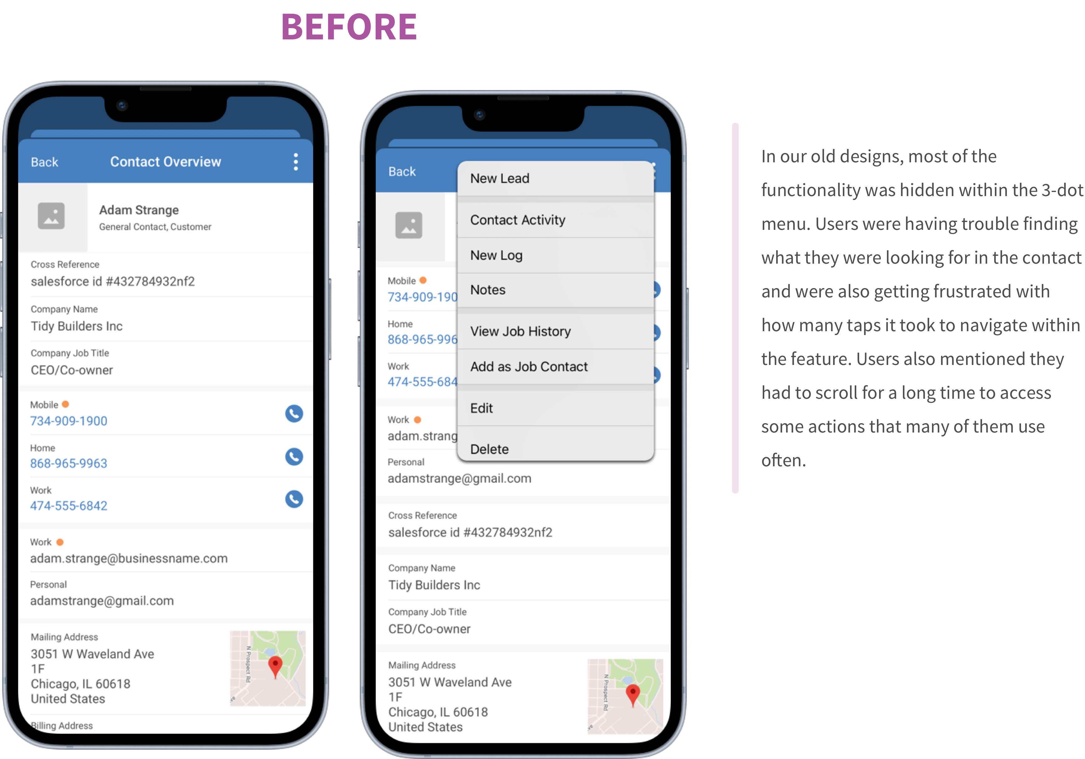
Key Finding 1: Users were unaware of some of the options they had available to them in the feature because many are hidden a few layers deep in menus.
Key Finding 2: Users are frustrated that they do not have a place to view all their call logs and are unaware they could be viewed in the contact activity.
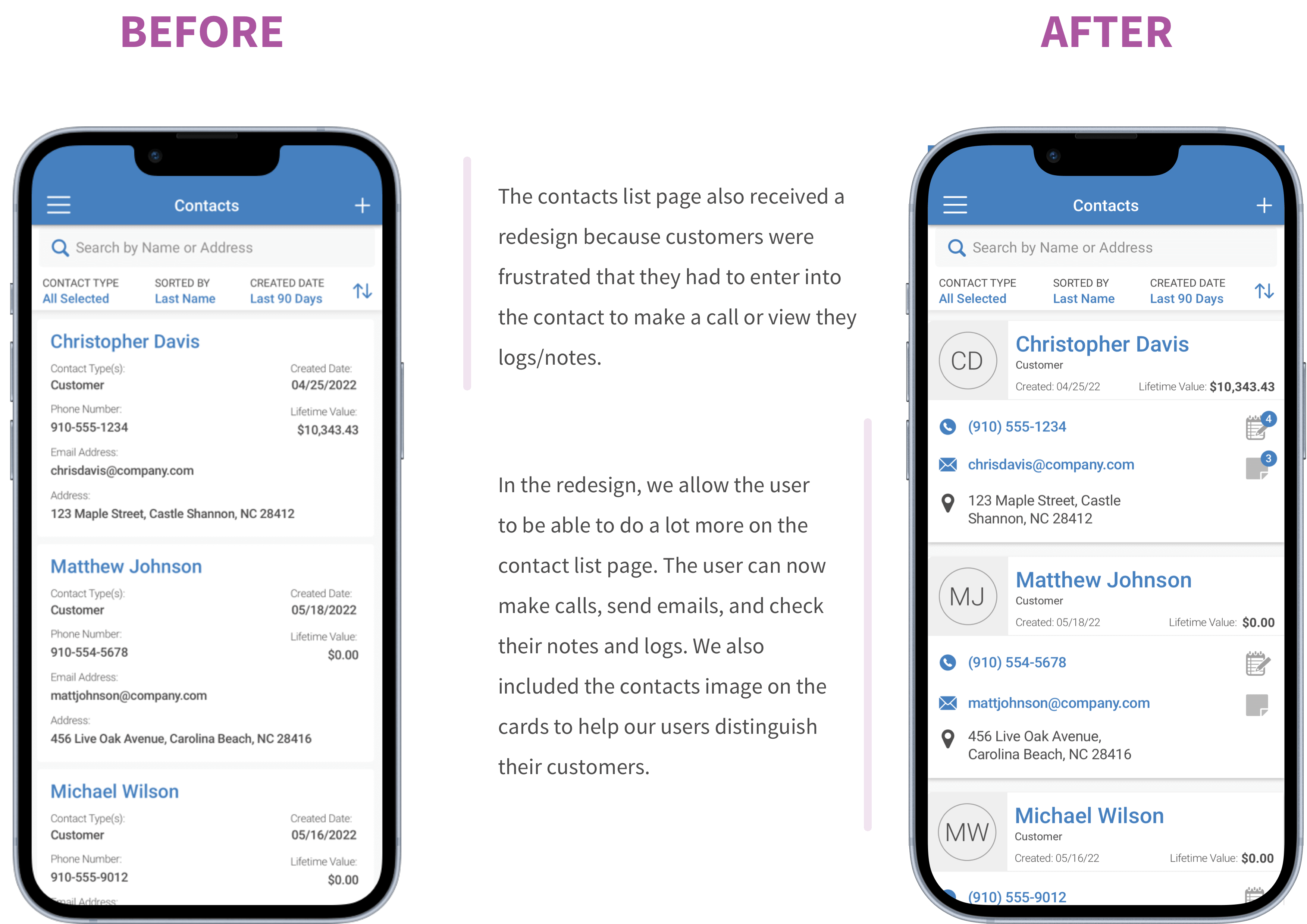
Key Finding 3: Users are frustrated that all their contact data is not presented to them on the overview.
Key Finding 4: Many of the features require too many taps to access them, leading to user frustration and a decrease in usage.

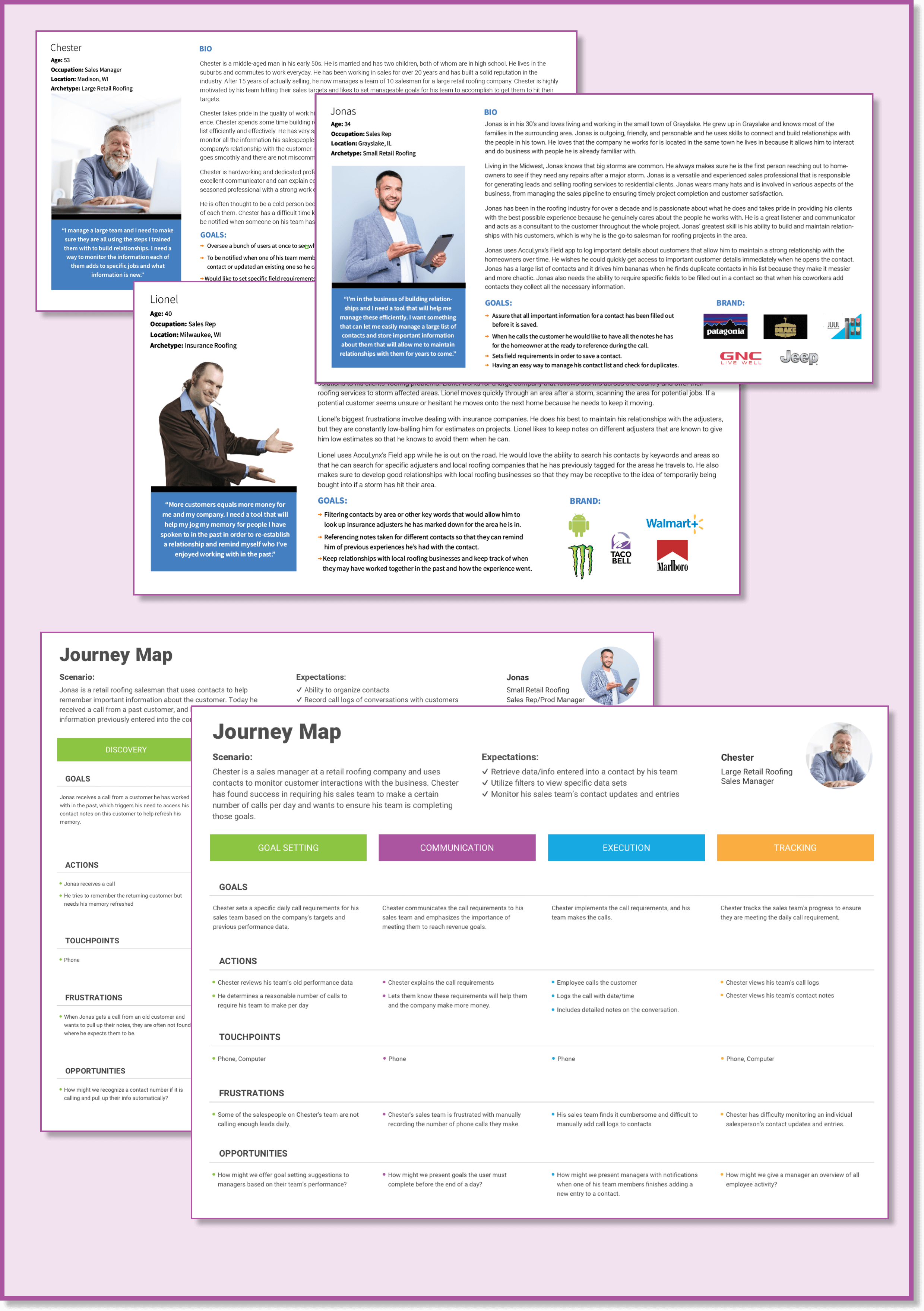
Understanding Who This is Made For
For this redesign, we needed to speak with the customers directly to understand their needs and frustrations. We interviewed several clients and stakeholders to understand the areas we needed to improve to please our customers. Below are the personas and journey maps we created from our findings from our user research. View more detailed versions of my personas and journey maps HERE.
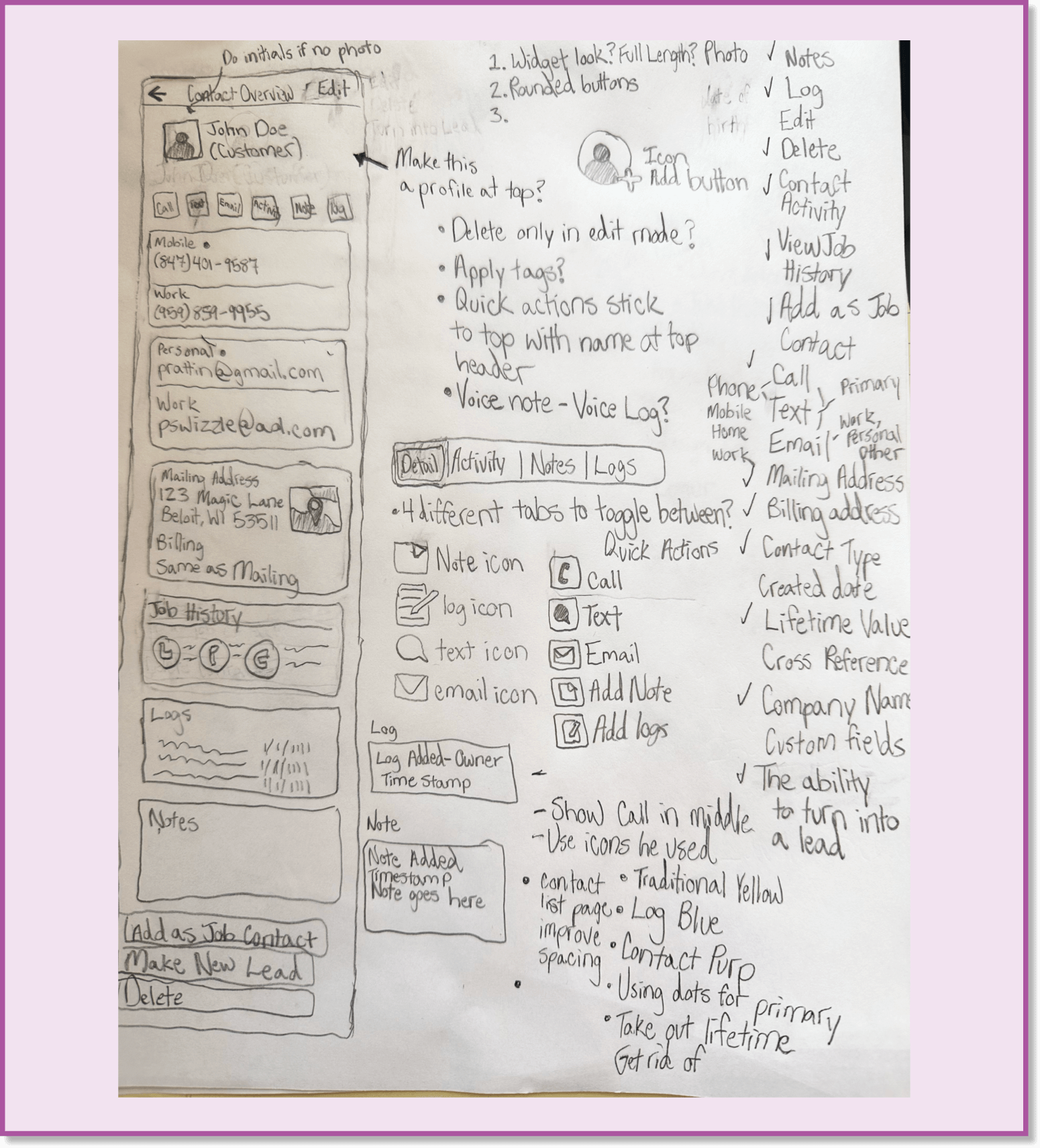
Rapid Sketching
The next step in the process was quickly sketching out some new ideas that could make the feature more user-friendly. I drew inspiration from other CRM applications and began writing down the features I liked from other applications as well as some ideas for how the interface could be better.
Mid-Fi Designs
Due to time constraints and the availability of design artifacts from the
old contact designs, I jumped right into mid-fi design screens to work out
some of my sketched ideas.
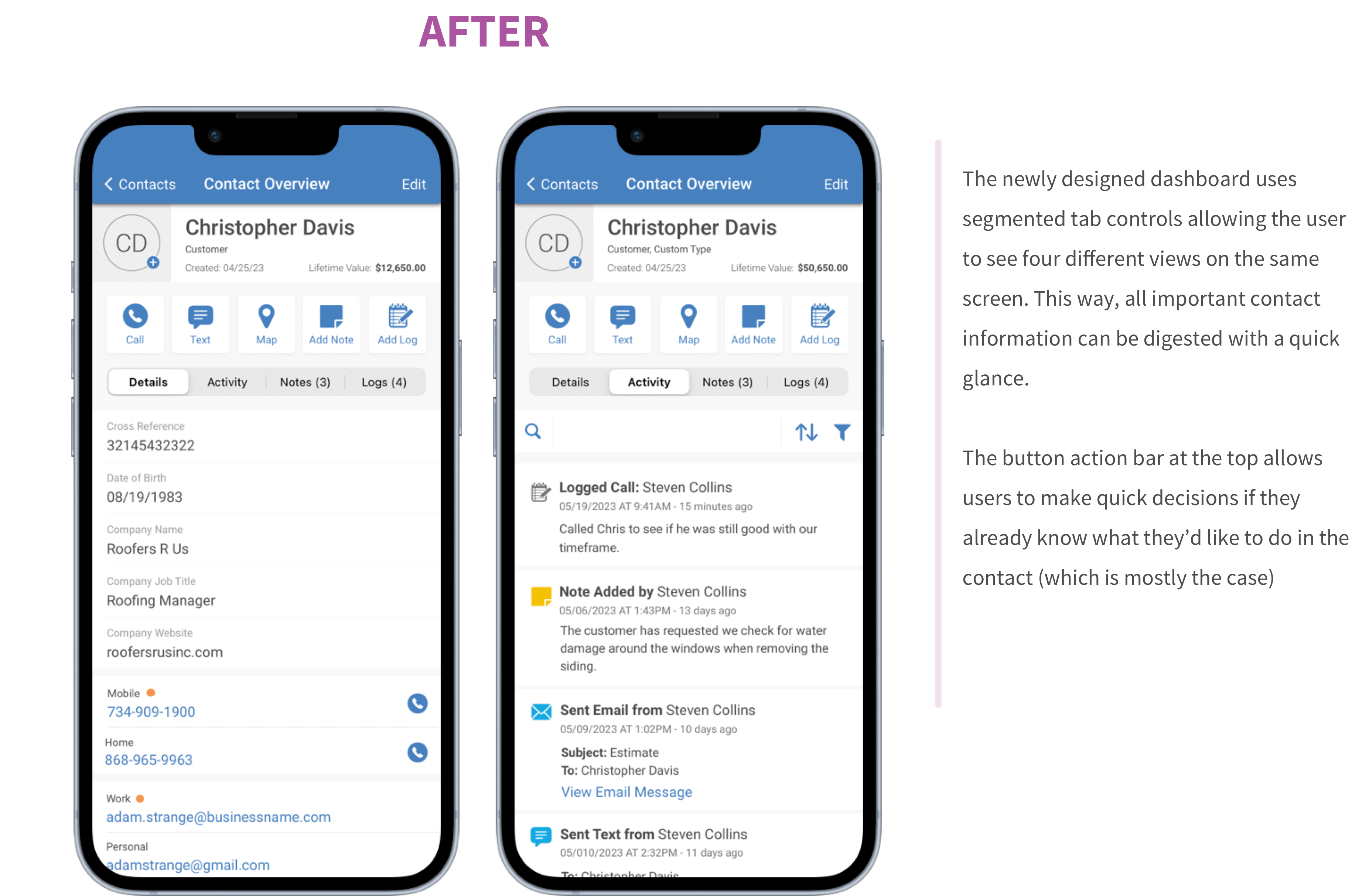
In these designs, we included segmented controls that allow the users to see
four different views, all on the same screen. This was added to help
eliminate user frustrations around navigating several layers deep within
menus to find what they were looking for.
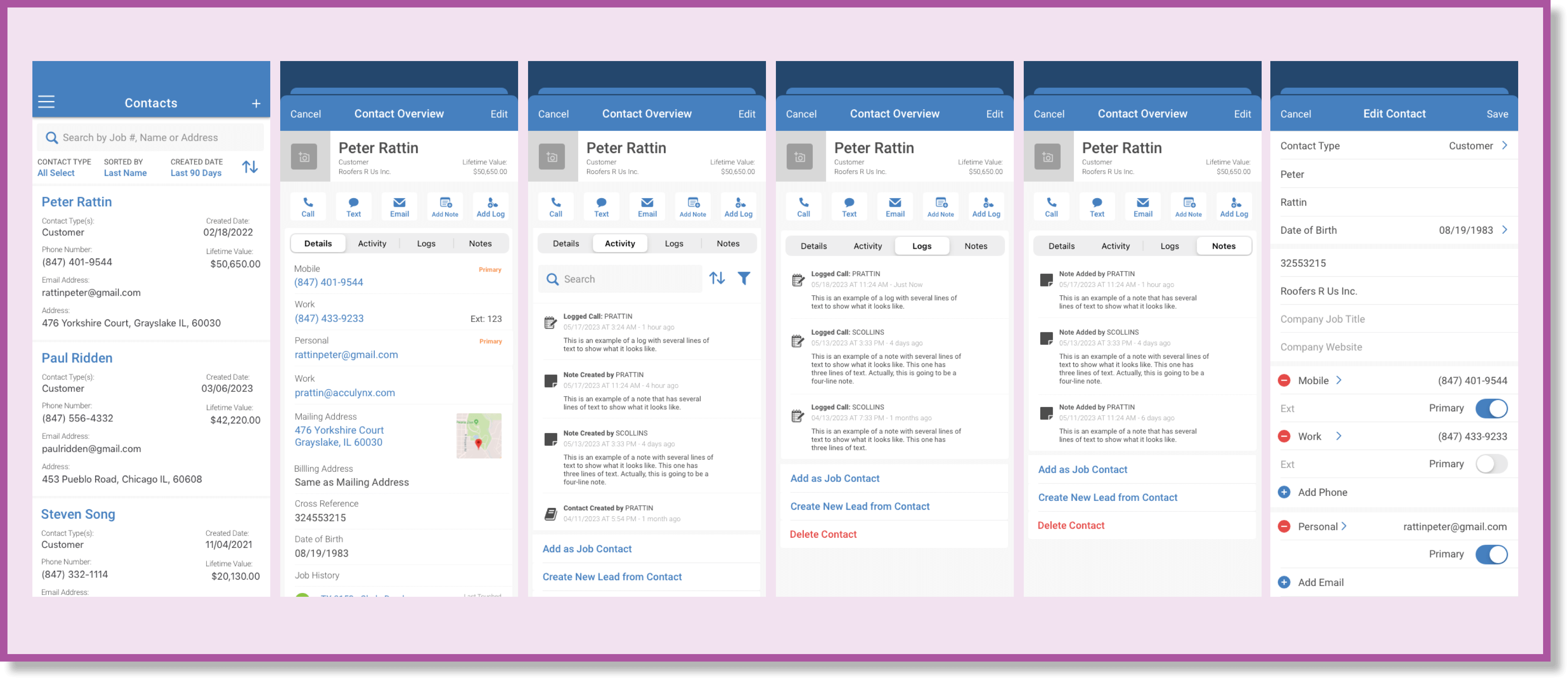
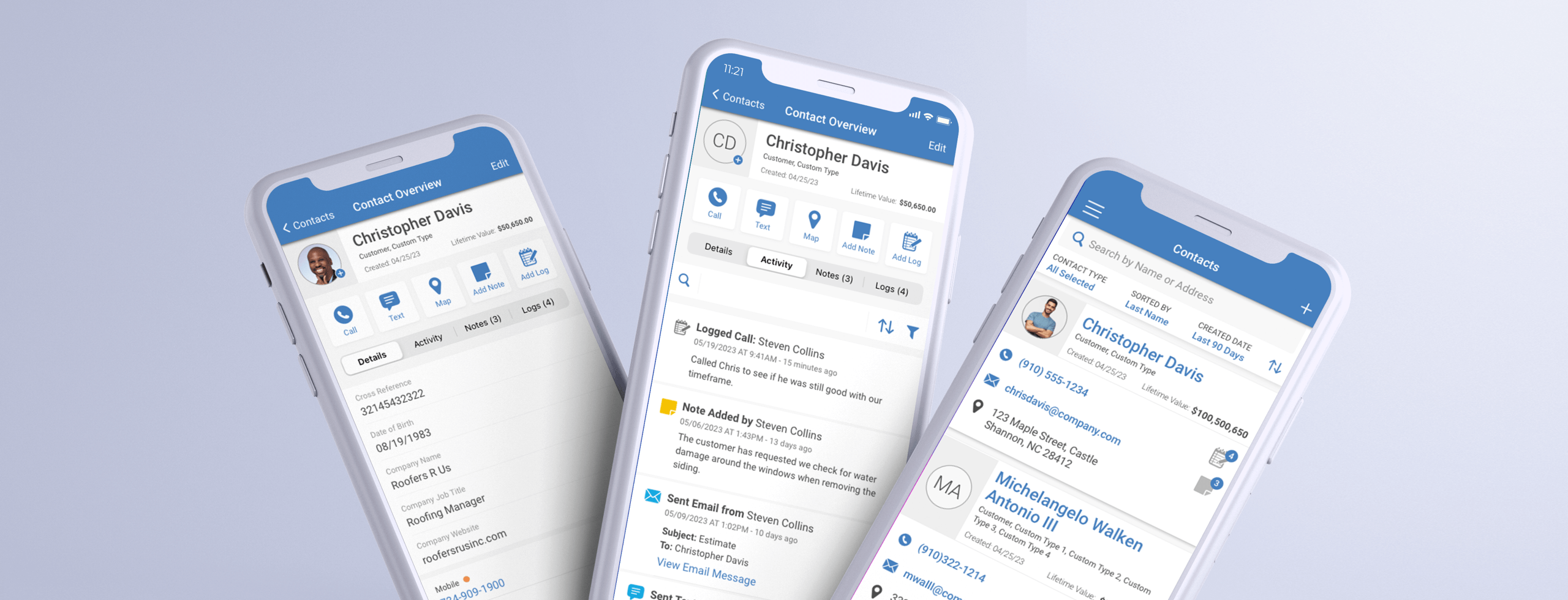
Hi-Fi Designs
After showing the designs to our developers and working through the areas
that would be difficult to code, we finalized our designs. Below are the
before (what our old CRM looked like) and after (our new redesign).
We addressed our research’s key findings by creating a simple and
easy-to-use contact interface. The new design includes several quick actions
to allow users to use one of the five most common actions within contacts.
Please see some of the other changes I made to the design below.
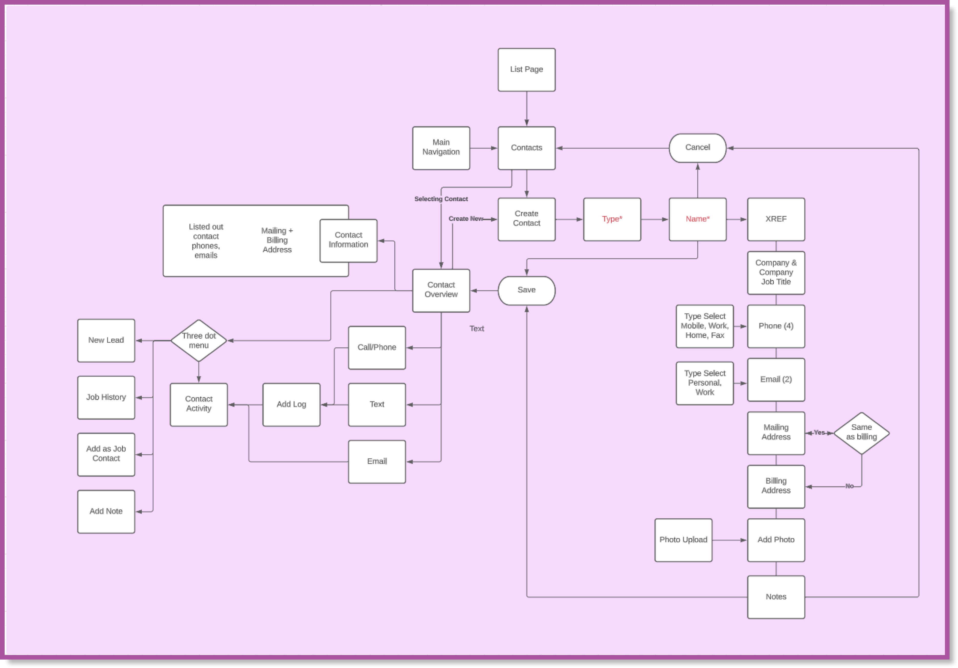
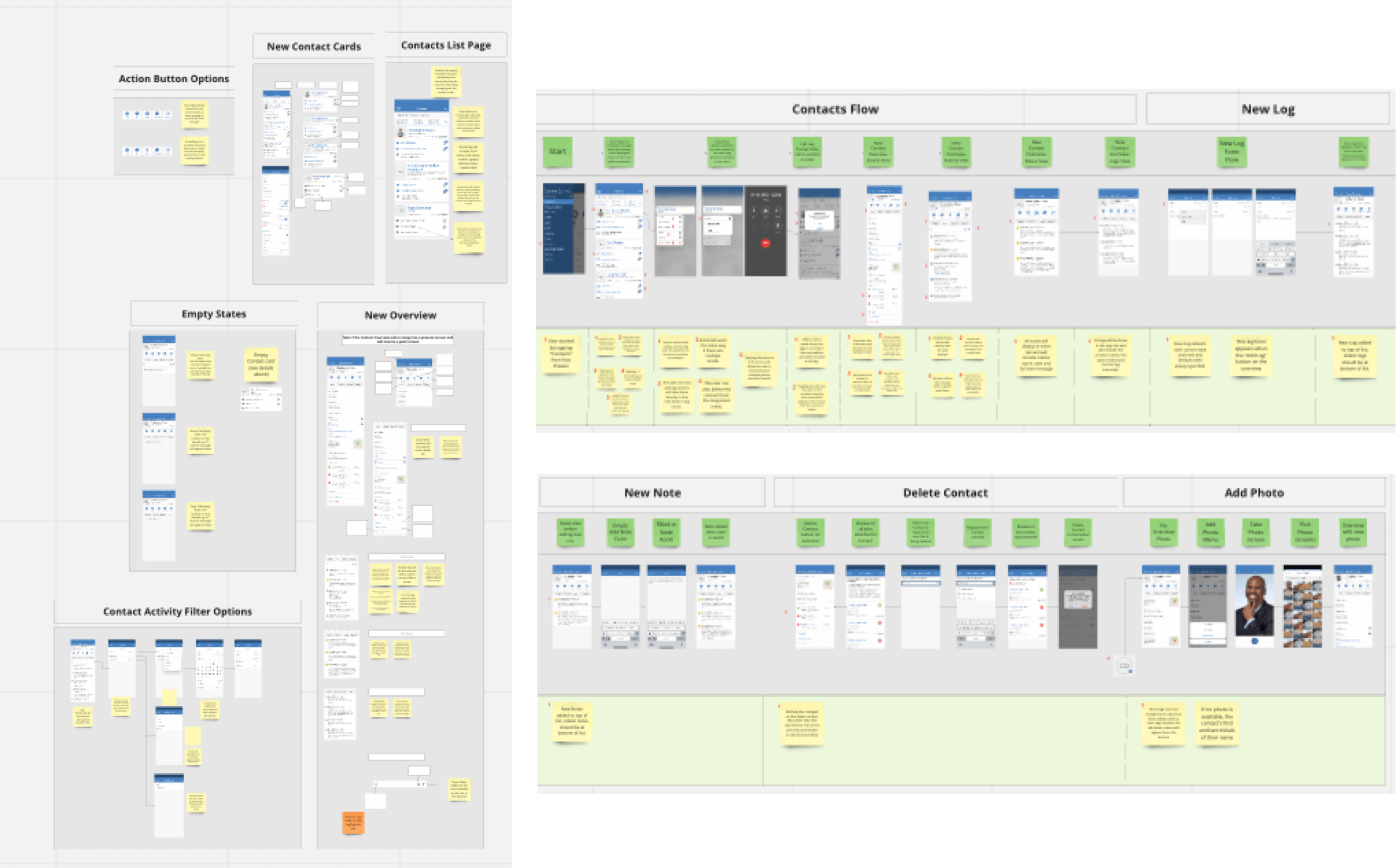
Design Handoffs
Once the final design files were complete, the last step was to create flows
and descriptions for our developers so that they could understand how each
action in the feature behaves. I used Miro to lay out each scenario’s flow
and tried to anticipate any questions they might’ve had while working on it
by providing extra clarification in complicated areas.
At AccuLynx, we’ve found that our developers prefer this design handoff
method because it helps them understand the breakdown of the feature, and
they can quickly leave questions and comments for us.
Final Results
After introducing the new CRM feature to our users, we have seen a
significant increase in our contact’s usage data. We have seen an increase
of over 20% in the daily usage rate, and we are no longer receiving constant
complaints to customer support about the contacts feature. Our users are
pleased with the new design because it addresses all their frustrations that
we gathered through our user interviews.
Thanks for checking out my project!