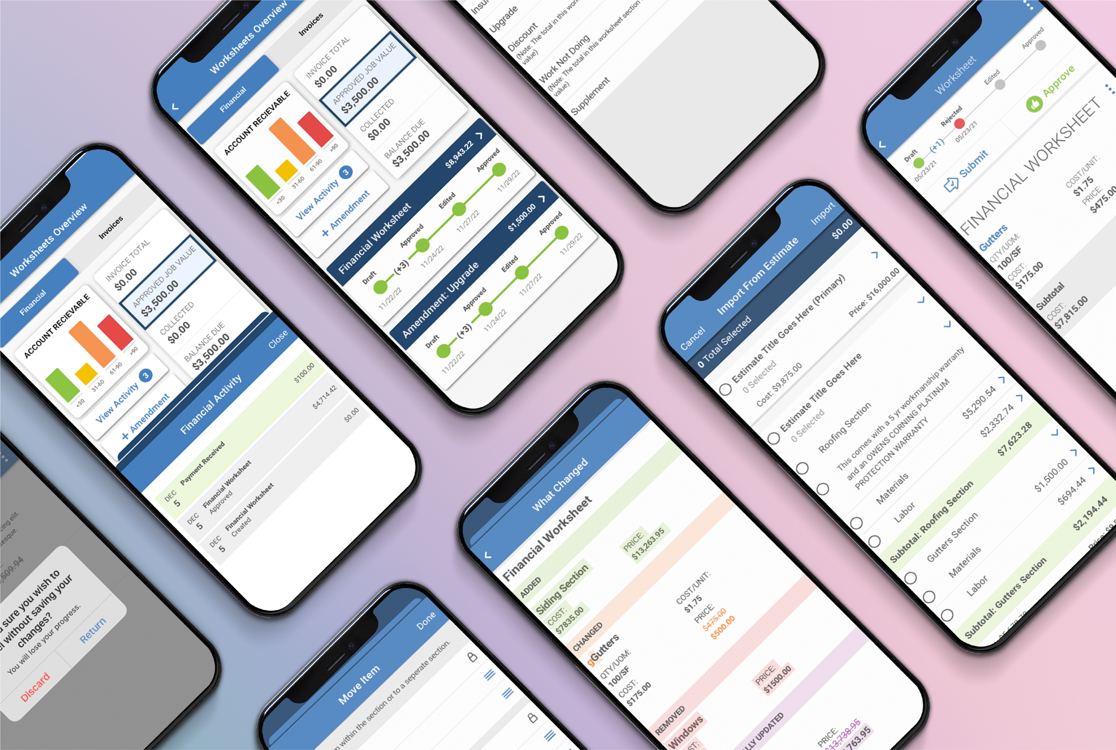
Financial Worksheets Mobile Feature
AccuLynx’s financial worksheet is an interactive hub for users that displays important financial information for their specific roofing jobs.
The Challenge
There were many elements designed for the Financial Worksheets feature on our web application that would translate poorly in a mobile setting. My challenge for this project was to determine which functions were important to include in the mobile version and which ones would result in a poor user experience.
Project Objective
My objective for this project was to adapt a complicated web feature for mobile. Customers had provided feedback requesting this feature be added to our mobile app. The goal was to use existing customer feedback to understand what our customers needed in the feature and then create a mobile-appropriate version.
Design Process
Learning and Understanding the Feature
The first thing I do when starting a new project is product discovery. This feature already existed on our web app, so my first step was to do research on the behaviors and conditions of the current web feature. I created task flows for each of the key actions to understand the user’s path and to help me block out the number of screens I would need. Below are a few examples of the flows I made to understand the complex feature.

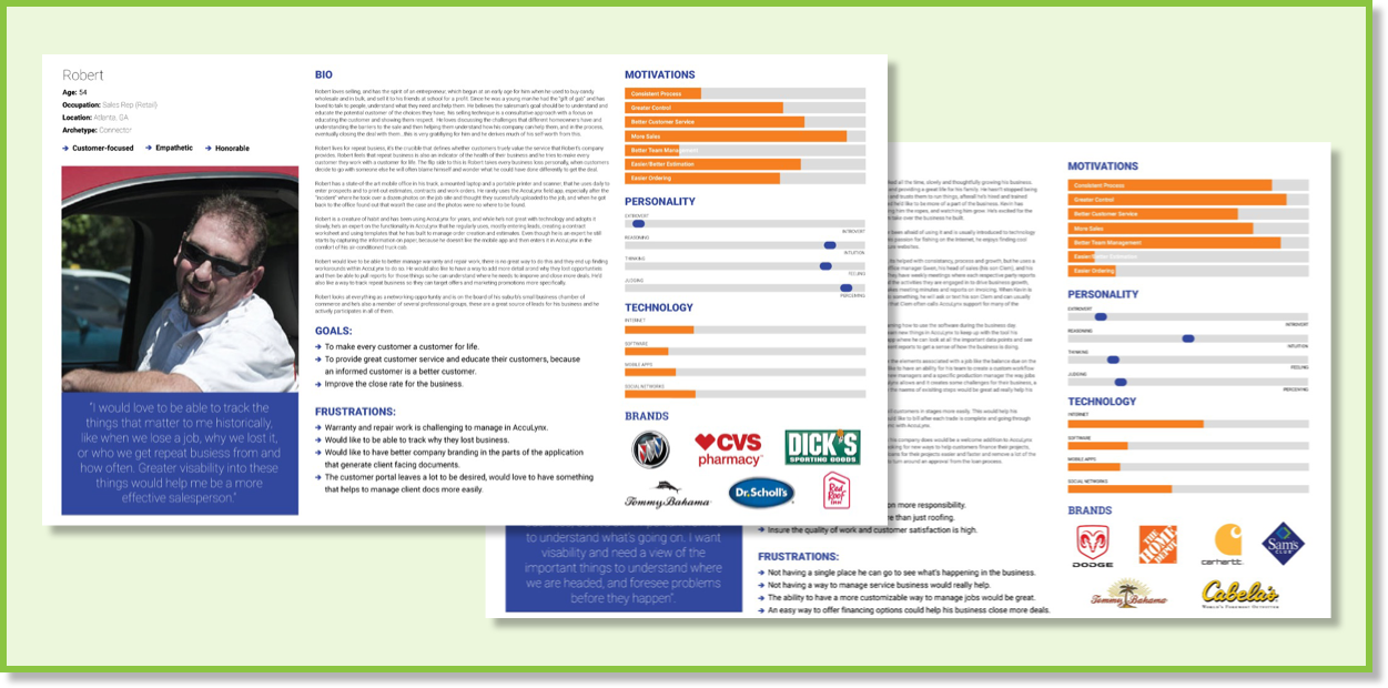
Understanding Who This is Made For
AccuLynx’s mobile app has existed for several years, so the personas for their customers were already created. Nonetheless, it was important for me to understand who we were building the feature for, as well as the use cases for it. I spoke with internal stakeholders and studied our personas to gain a better understanding of both.
Rapid Sketching
The next step in the process was to quickly sketch out ideas for the different screens we would need for the feature. This is always my favorite part of the process because it allows me to be creative and can help spark ideas that we can then use when designing the screens.
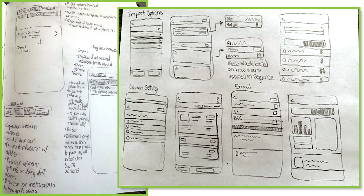
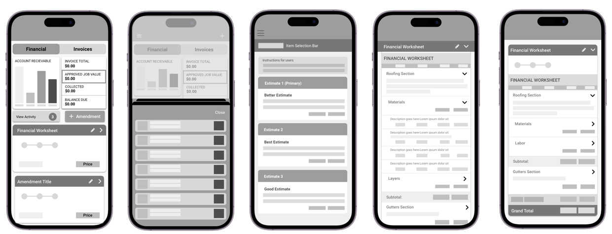
Lo-Fi Designs
Based off the sketches I made, I created some lo-fi designs to help me visualize which concepts worked and which ones did not. Making quick, blocked-out designs helps me test a lot of ideas in a short amount of time. These designs also allow for dialogue with my team’s developers and product managers to better understand the amount of time each design will take to develop and whether some design elements are worth including.
User Research
My design partner and I conducted six usability tests that gave us insight
into changes that needed to be made to our designs.
We provided our participants with several scenarios and asked them to show
us how they would complete each task on a handful of different clickable
prototypes. The test consisted of four scenarios with multiple tasks to
complete for each. A summary of the scenarios and each of the prototypes can
be found below.
HI-Fi Prototype
Scenario 1: Users were asked to explain how they would finalize a job value after completing their estimates for a job.
Scenario 2: Users were asked to import several items from a non-primary estimate into the financial worksheet and then save their progress.
Scenario 3: Users were asked to add a new child item to the package that they had just imported.
Scenario 4: Users were asked to submit and approve their completed worksheet.
Key Findings:
Below is a list of my key findings from the usability tests that my partner and I conducted:
Key Finding 1: Users were getting lost in the nested items layout and often misunderstood their location in the feature.
Key Finding 2: It was not clear to users which items were parent items and which were child items.
Key Finding 3: The users expected that after changes were made to the financial worksheet, the customer would somehow be notified of the changes.
Key Finding 5: Many of the users expressed their fear that they would lose their progress if they used the back button to return to the previous screen.

Next Steps and Recommendations
Based on the user research, I created a list of next steps and recommendations that would help better align the designs with what the users were looking for:
Recommendation 1: Rework the nesting of parent and child items on the Financial Worksheets so tt users know where they are in the navigation at all times.
Recommendation 2: Revisit the design for the “import from estimate” feature to make it more clear which estimate is being viewed and the items that have been selected.
Recommendation 3: Re-examine the overview page designs so that users quickly know how to add amendments and view their Financial Worksheets.
Please stay tuned to see the finished product!
We are still in the process of making the necessary changes to our designs and getting approval from company stakeholders.